
It All Begins HereA Unified Icon System for IPG Photonics

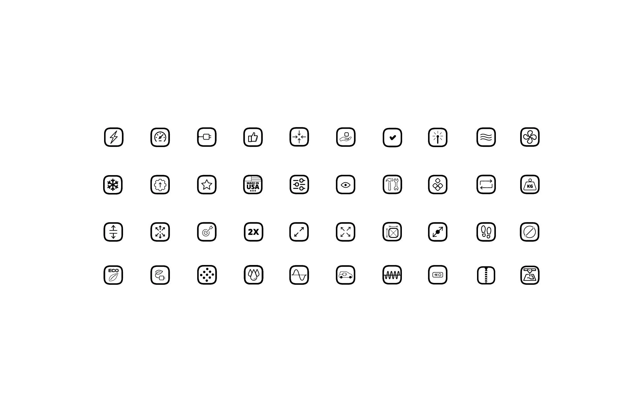
Before this project, IPG had no defined icon system. Icons used across trade show materials, ads, presentations, the website, datasheets, and brochures were fragmented and inconsistent different styles, weights, and treatments depending on who made them and when. That inconsistency chipped away at the brand's polish across every touchpoint where icons showed up, which was nearly everywhere.
I built the icon system from the ground up as sole designer, developing a clean, technical, geometric line style suited to IPG's precision-engineering identity. Because the system needed to hold up across such a wide range of applications.

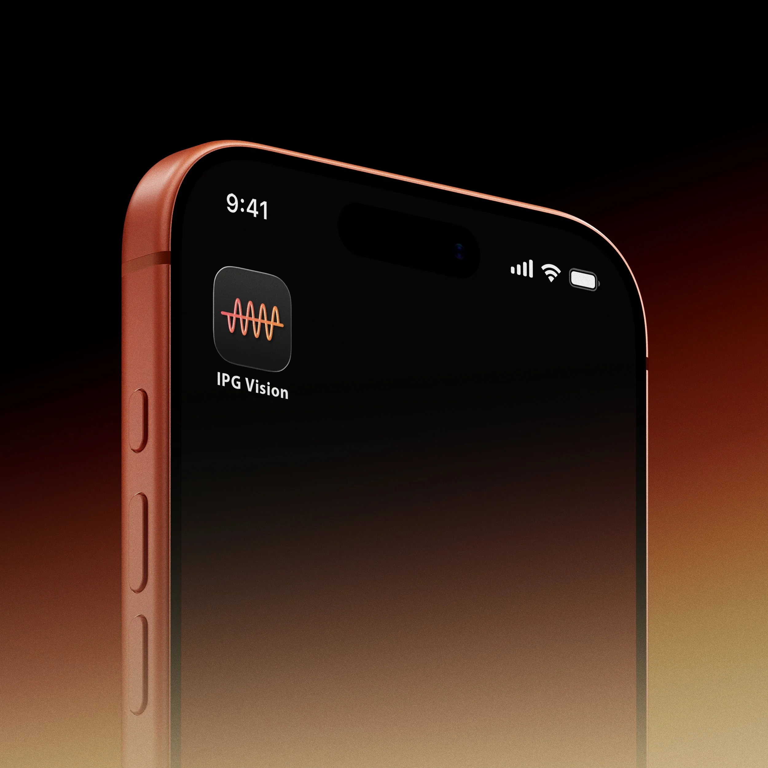
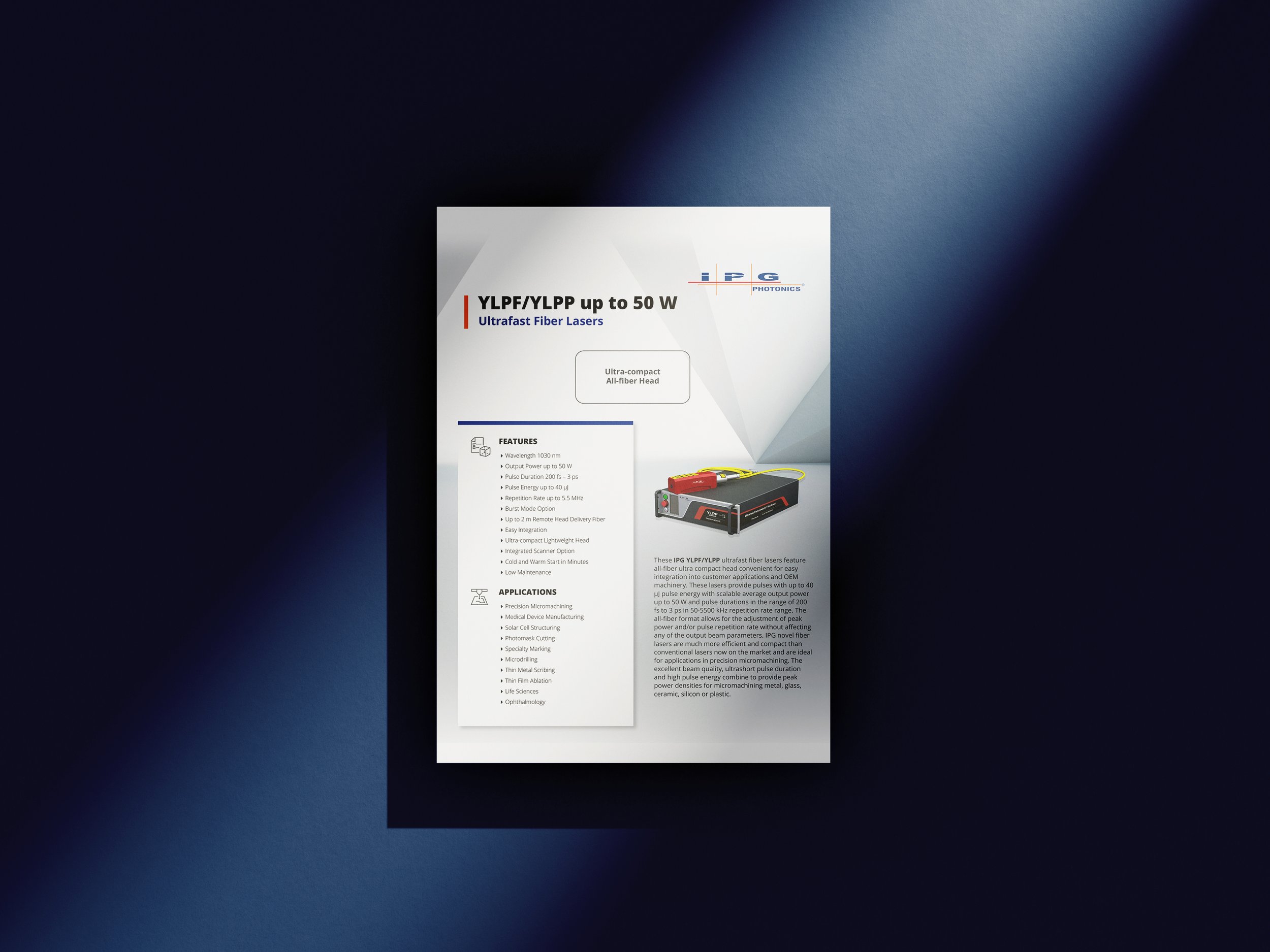
from small datasheet callouts to large-scale trade show graphics the priority was consistency and flexibility: a shared visual grammar (stroke weight, geometry, level of detail) that could scale up or down without losing clarity or cohesion.
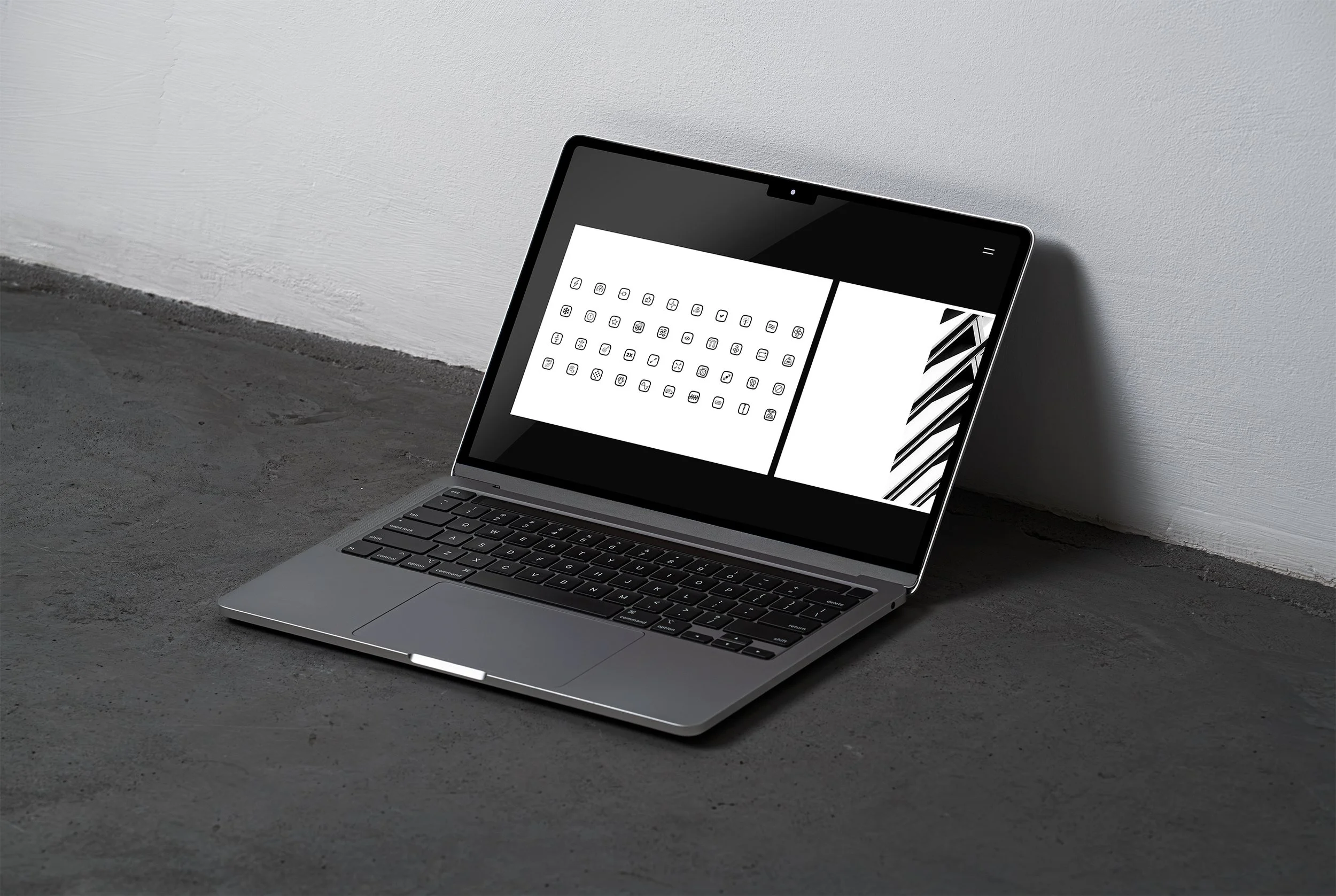
The system gave IPG a single, consistent icon language to draw from across marketing, sales, and product materials replacing a patchwork of one-off icons with a unified visual system built to scale across the company.